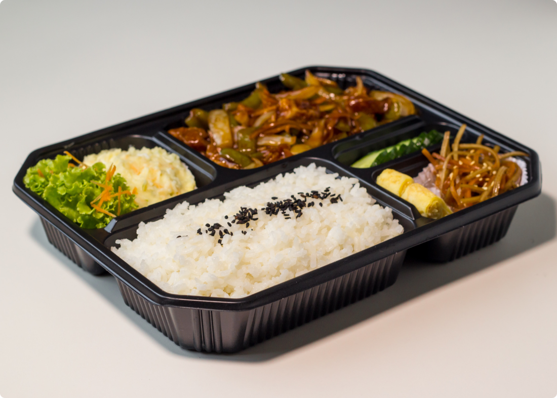
China Gourmet Longmont

Adapting a family-owned restaurant to the pandemic.

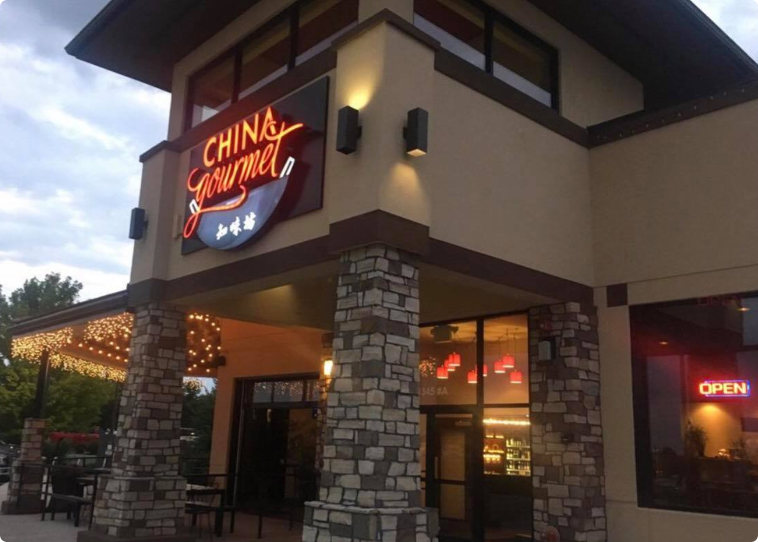
China gourmet longmont restaurant building

Overview

squiggly red line

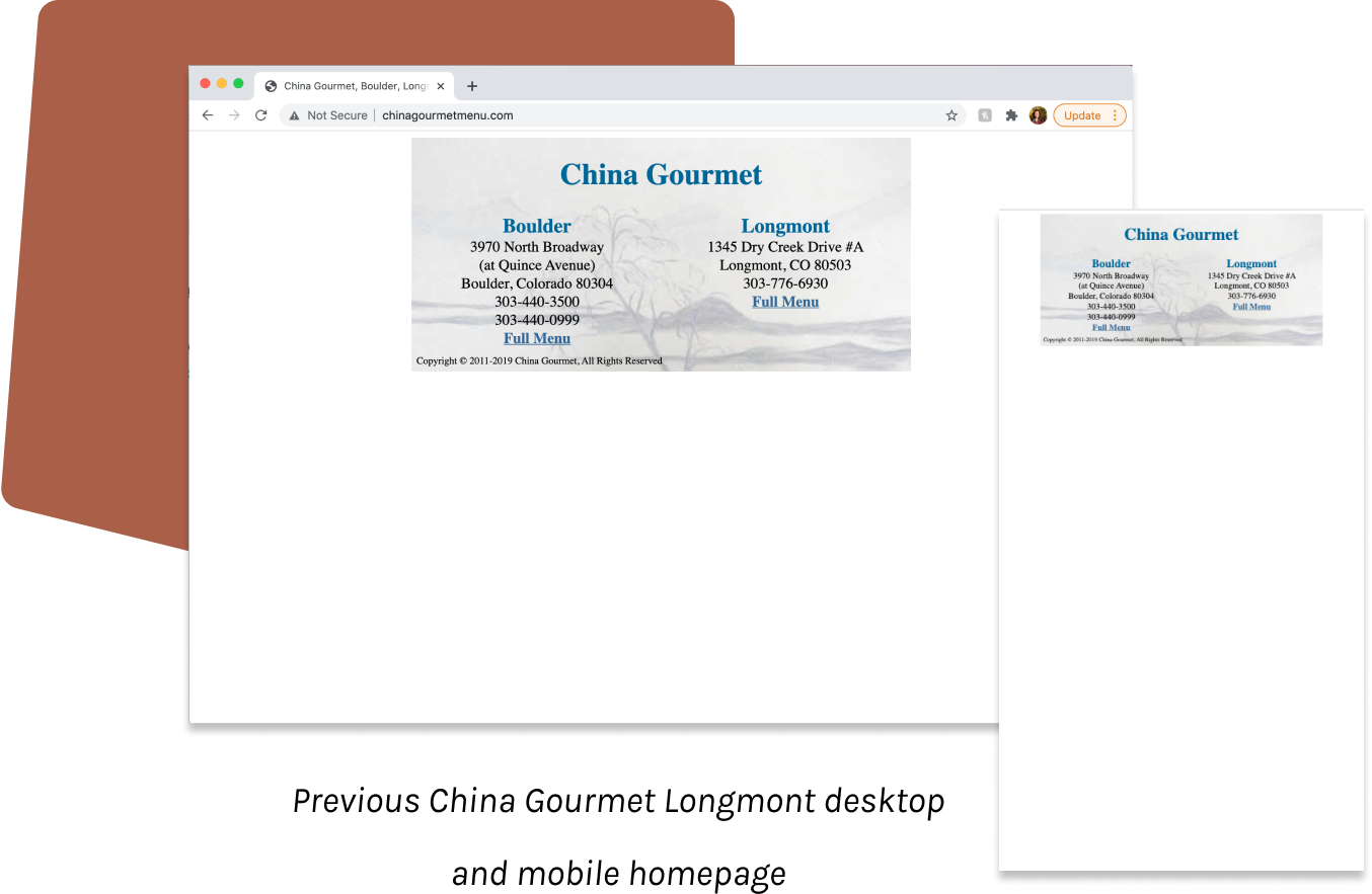
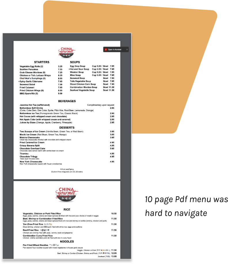
China Gourmet Longmont is a local family owned Chinese restaurant where I worked as a cashier and waitress for two years. Their original website hosted information for both the Longmont and Boulder locations, leading to customer confusion when ordering. They also did not have their online ordering options linked, and the menu led to a 10 page pdf which was difficult for users to scroll through, especially on mobile. These issues became exacerbated after COVID19 hit.

Having just taken a web design class the previous semester, I took on the project of redesigning and coding a new website for them to practice my newly learned web design skills, and help out a restaurant that I cared about. I redesigned the desktop and mobile version of China Gourmet Longmont’s website with Figma, and coded the design with HTML/CSS/Javascript. After launching in January of 2021, the website has streamlined the online ordering processes for customers, and has over 2,000 visits monthly.

Location: Longmont, CO
Timeline: December-January 2020
Stakeholders: Nora(restaurant owner), Customers
Team: Xiaoyu Hu, Andrew Wu
Role: Website designer and developer
Tools: Figma, HTML/CSS, Javascript

The Problem

squiggly red line

Operating a Restaurant in the COVID Environment

China Gourmet Longmont’s original website was a single static page with outdated graphics. After analyzing the website and discussing it with the restaurant owner, I identified three main issues with the current website.

1. China Gourmet has two locations in Colorado: one in Longmont, and one in Boulder. Both locations sharing one website led to customers ordering from the wrong location at times, employee confusion when customers arrived expecting orders that were not there, and food waste due to extra orders being made at the wrong location.

2. The menu displayed on the website led to a ten page pdf which was cumbersome for customers to scroll through, especially on mobile. This became a significant issue after online ordering became the new normal, in the midst of COVID19.

3. China Gourmet Longmont began to take online orders through Doordash, Chownow, and Grubhub, but this change was not reflected on the current website. The official website needed to be updated to inform customers of the new online ordering options, and help the restaurant retain business through lockdown periods.

After establishing these main issues to address in my redesign, I reflected on my past customer interactions as a cashier and waitress, and met with my coworker to flesh out the main user groups for our website.

Understanding Users

squiggly red line

Balancing Multiple Stakeholders

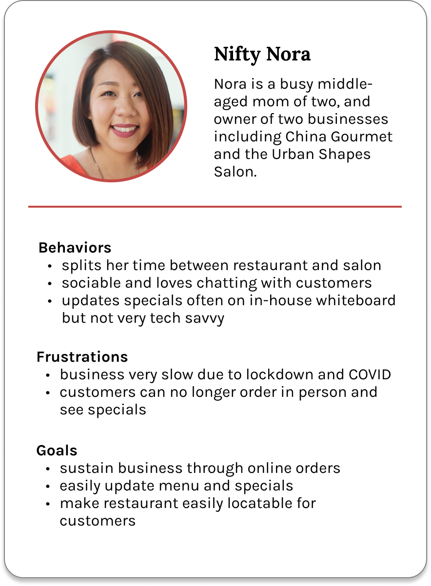
Thinking about the main user groups for this project was interesting, because I had to keep both the client, Nora, and the customers in mind. Nora, the restaurant owner, balances her two businesses with her two school-aged children, and always has a packed schedule. However, she also changes the menu often with new specials and holiday entrees, so the new menu must be both navigable for the customers, and easily editable for her. These needs combined with my current limited web development knowledge required some creative thinking on my part, as I iterated through possible solutions in my design process.

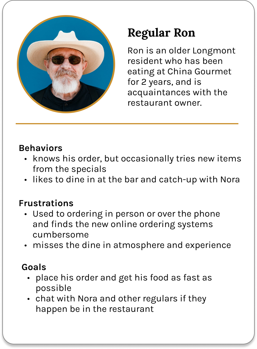
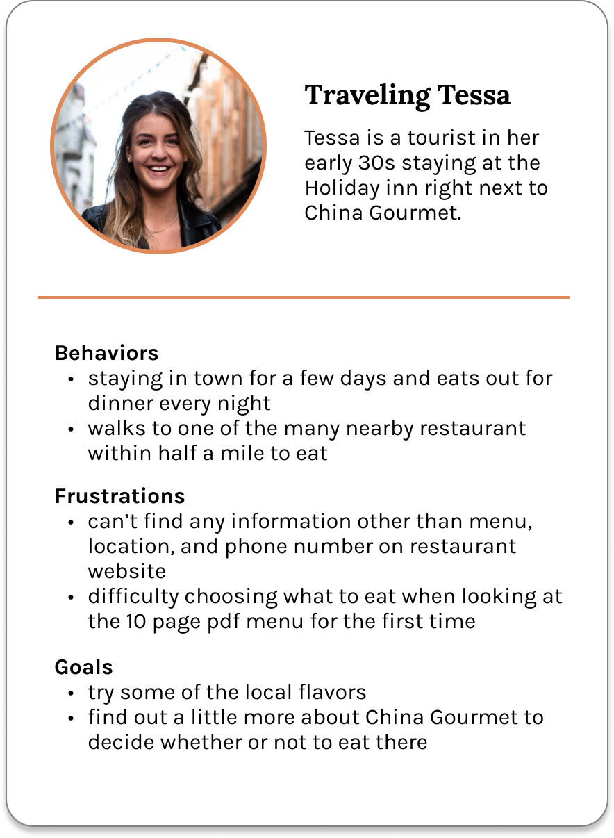
Focusing more on the diners now, China Gourmet Longmont’s main customer base is made of a mix of regulars and tourists. For regulars who already know what they want, there should be a clear order button immediately on the landing page. Tourists on the other hand, would benefit from a home page, with some additional information on the restaurant and food. What both types of users had in common was the need for a mobile-friendly site, and reliable updates on changes to the restaurant’s hours and seating caused by COVID19. Keeping these insights and the three main issues I identified previously in mind, I began to brainstorm possible website solutions.

My Process

squiggly red line

Breaking Down the China Gourmet Site

I began my design process by looking at several other websites of local Chinese restaurants, and noting how they organized their menu and information. Considering common user flows found on other sites, and the specific issues that the China Gourmet website was facing, I decided to sort the website into four separate pages. The home page would introduce new customers to the website, and also direct regulars to the new online ordering methods. Some other websites had their hours and location information on the home page as well, but I decided to separate this into another page so that users could immediately access the information from the navigation bar, rather than searching through other pages. Considering how the hours may be updated frequently as the restaurant adjusted to the new COVID19 environment, I believed that this would be the best layout to make the information easily accessible to users. Now that customers had the option to place both phone or online orders, it was important to distinguish between the two, and give clear instructions to prevent confusion. I wasn’t sure whether to include this information on the home page with the order button, or the menu page, and also didn’t want to overload customers with many instructions immediately, so I decided to present the instruction in a popup after users clicked the order button.

Sorting the website content into these four pages, I first sketched some basic layouts to place the main elements of each page. I then moved to mid-fidelity mockups in Figma, where I pulled from pictures of the restaurant’s food, physical building, and logo to come up with some color palettes and typography to match the restaurant’s contemporary brand. Below I discuss my thought process behind each page in further detail.

1. Revamping Home Page

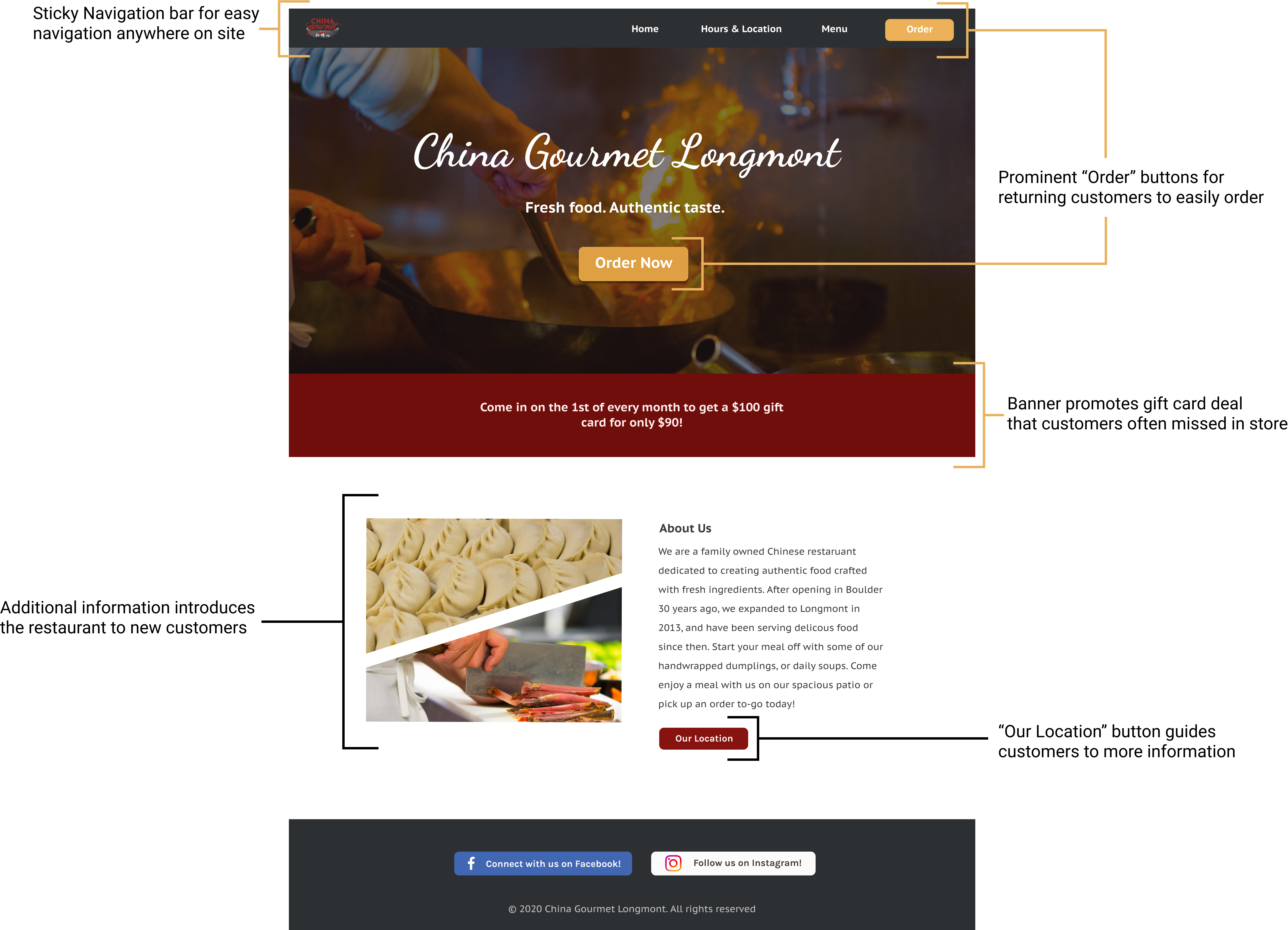
In early sketches I wasn’t sure how much information to place on the home page, as many local competitors displayed their hours and location, about, pictures, menu, and more. Considering the current COVID19 climate, and the modern brand of the restaurant, I decided to create a separate hours and location page for easy access, and keep the home page clean and simple. Moving onto the actual content of the homepage, I designed with both the regulars and new customers in mind. To create a welcoming space for new customers, I added an “about us” section, a “specials” section, and pictures featuring the cooking process and food. For returning customers, I placed a prominent “Order” button on the landing page, and in the navigation bar for easy ordering from any page.

2. Presenting Hours-and-Location Info

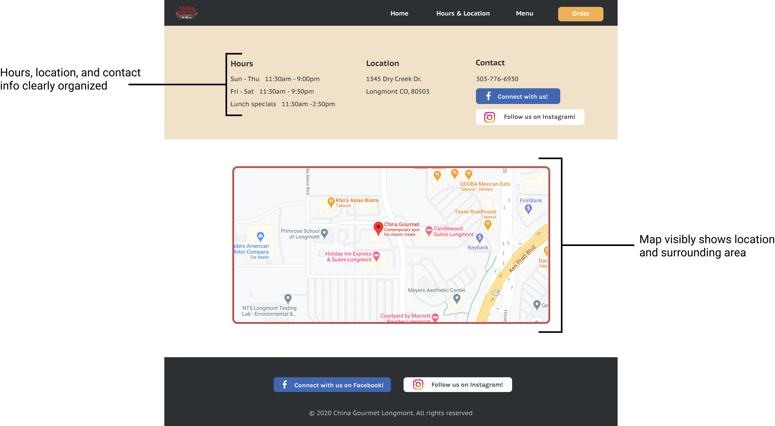
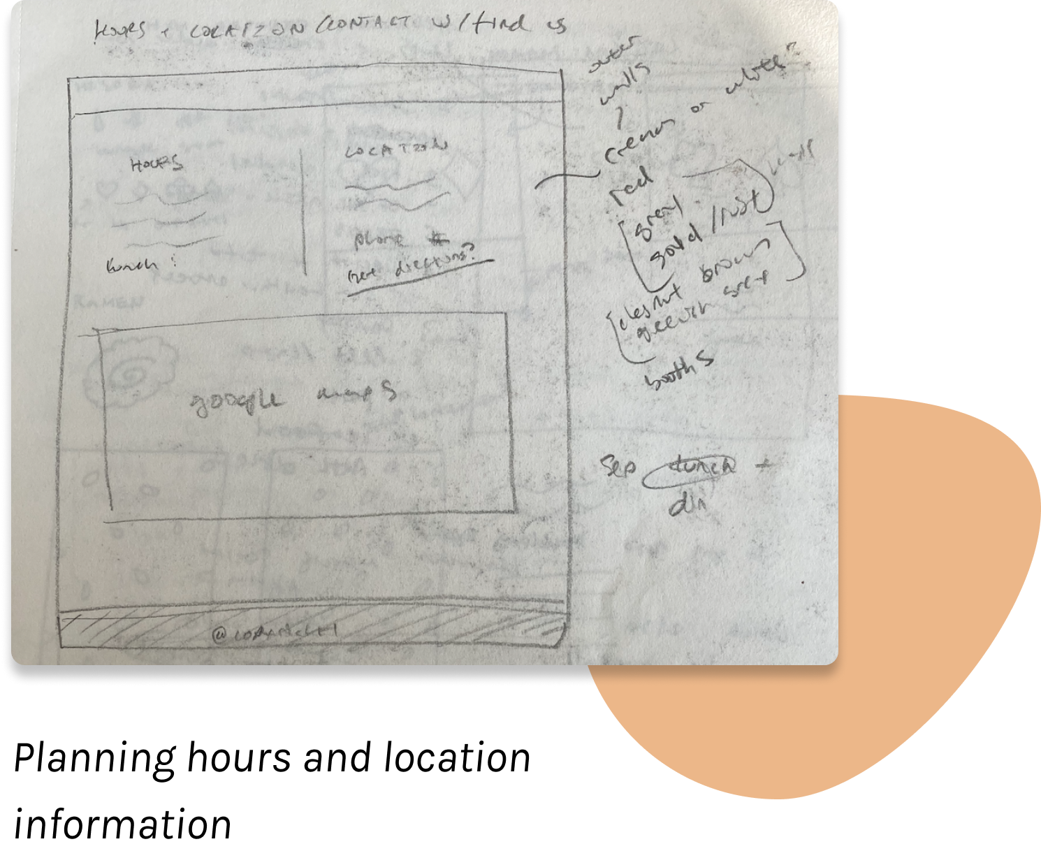
I made a separate “hours and location” page so customers could quickly access the information without searching through the homepage or footer. We also embedded a google map so that new users and drivers from online delivery services could quickly view the location, or open directions in maps.
3. Differentiating between Online and Phone Orders

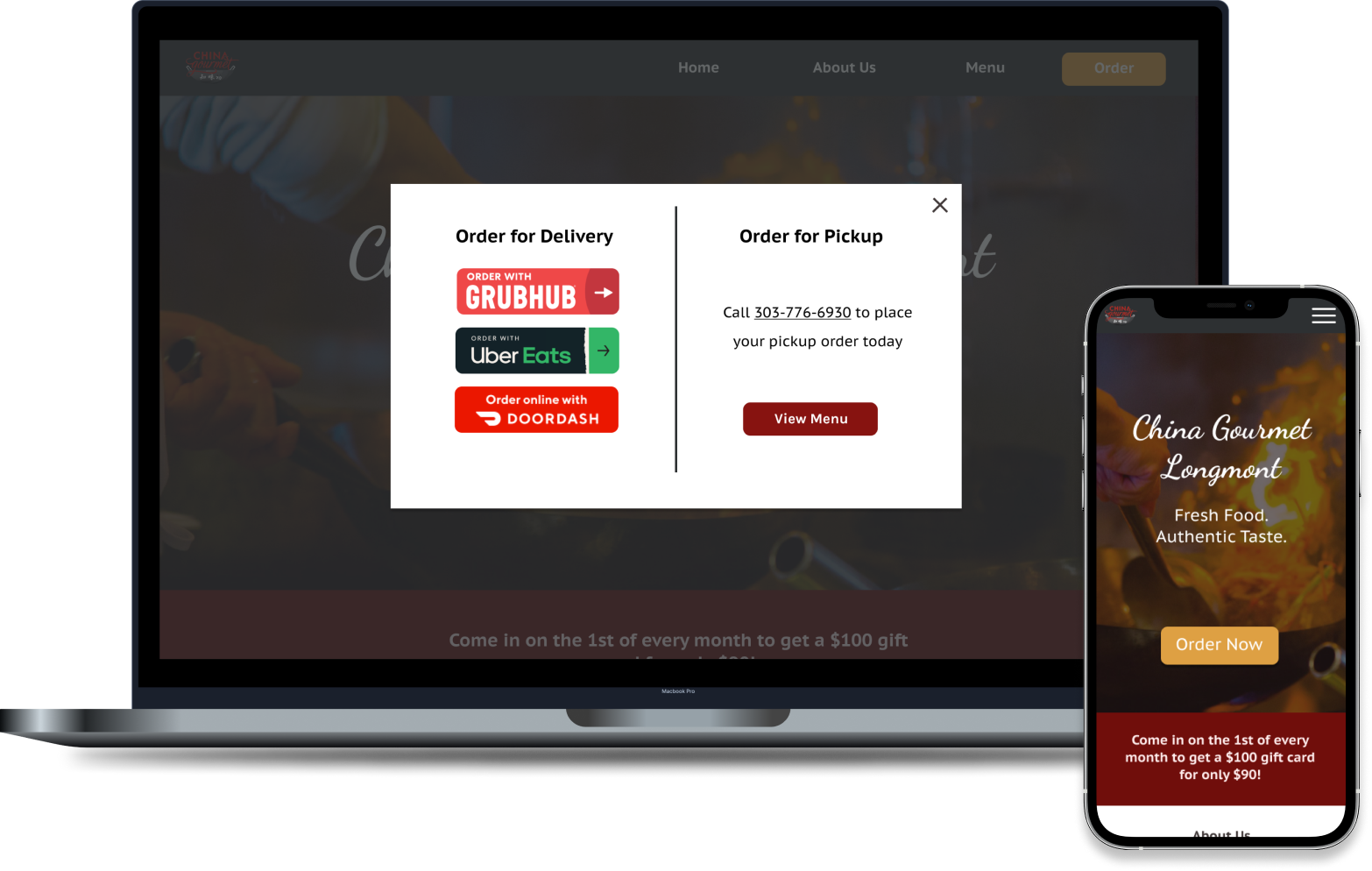
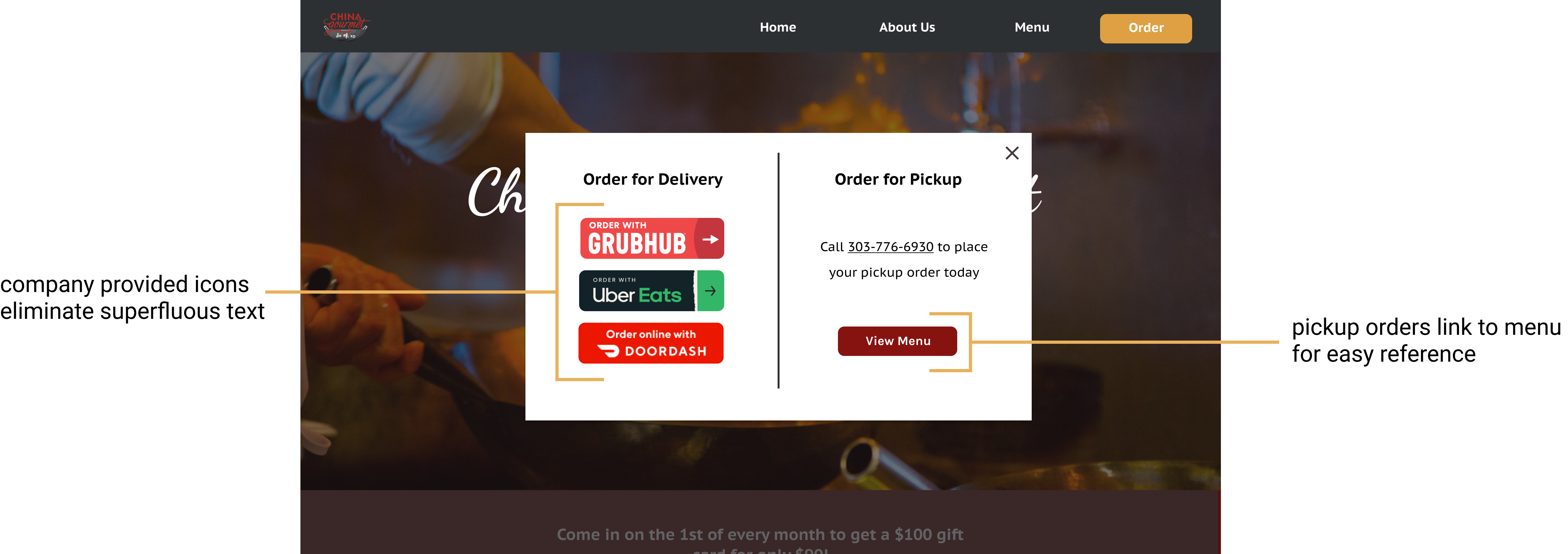
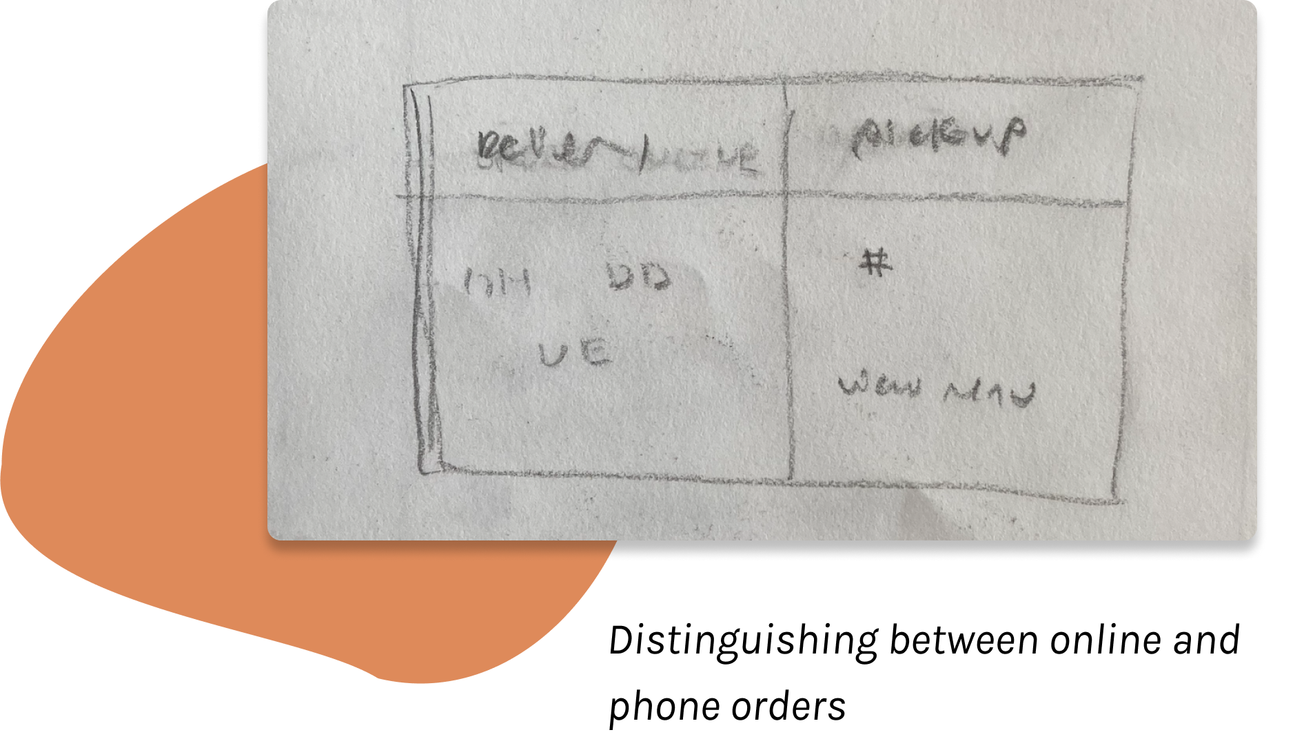
Now that China Gourmet takes both phone orders and online orders it is important to distinguish between the two, and make customers aware of the new online ordering services. Deciding where the “Order” button would lead was an interesting challenge. Initially I considered doing a separate order page with instructions on each ordering option, but felt that this might create an awkward user flow for customers trying to look at the menu and then order. However, I also didn’t want to list out the ordering instructions on the homepage, which would ruin the minimalistic and modern theme of the website. To address these considerations, I settled on having the “Order” button open a popup that clearly illustrates these two ordering options, and links to the menu. Since the order button is also included in the navigation bar, this would allow users to easily pull up the order options on the menu page after they have decided what to eat.

4. Navigable Online Menu

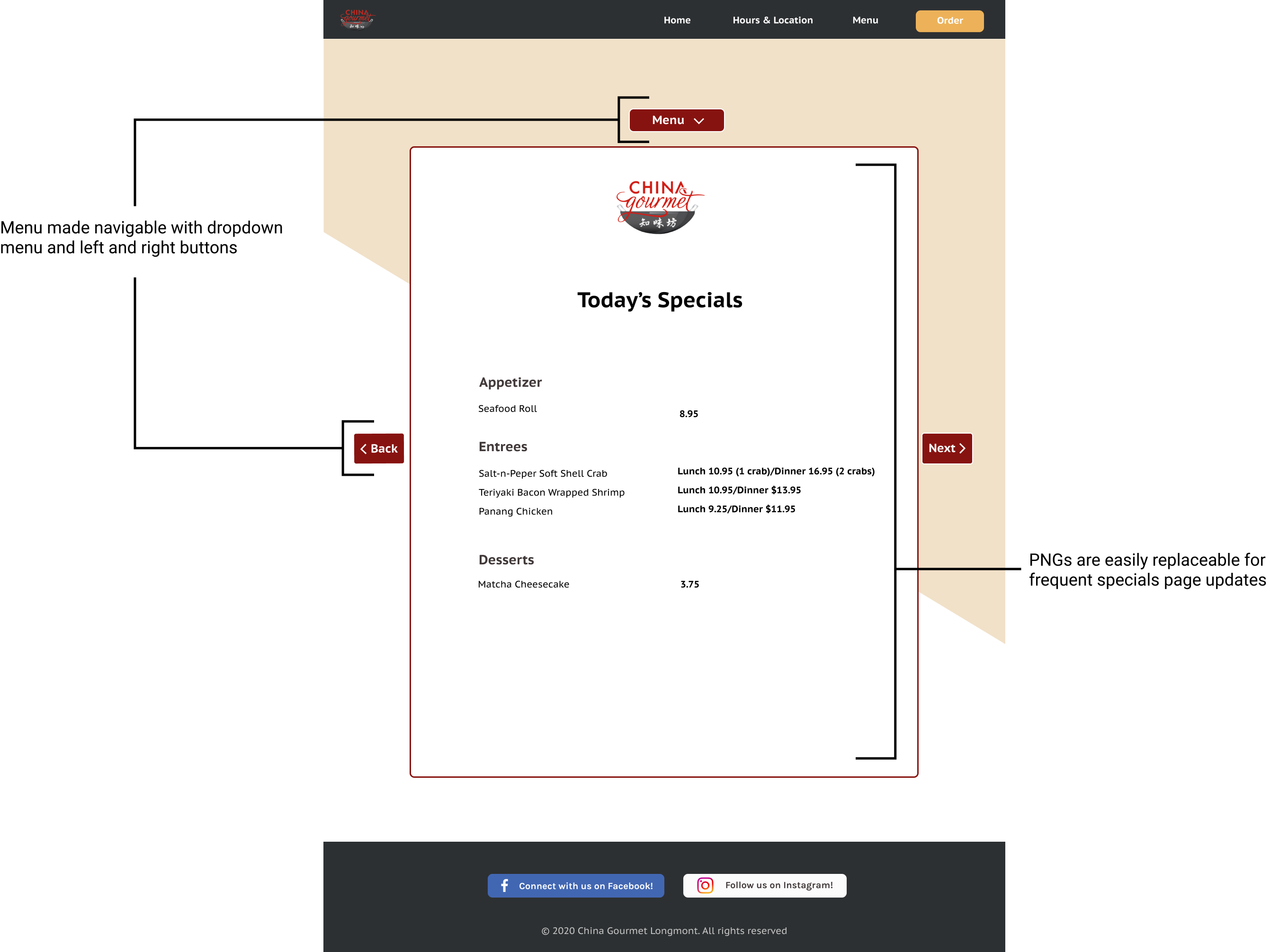
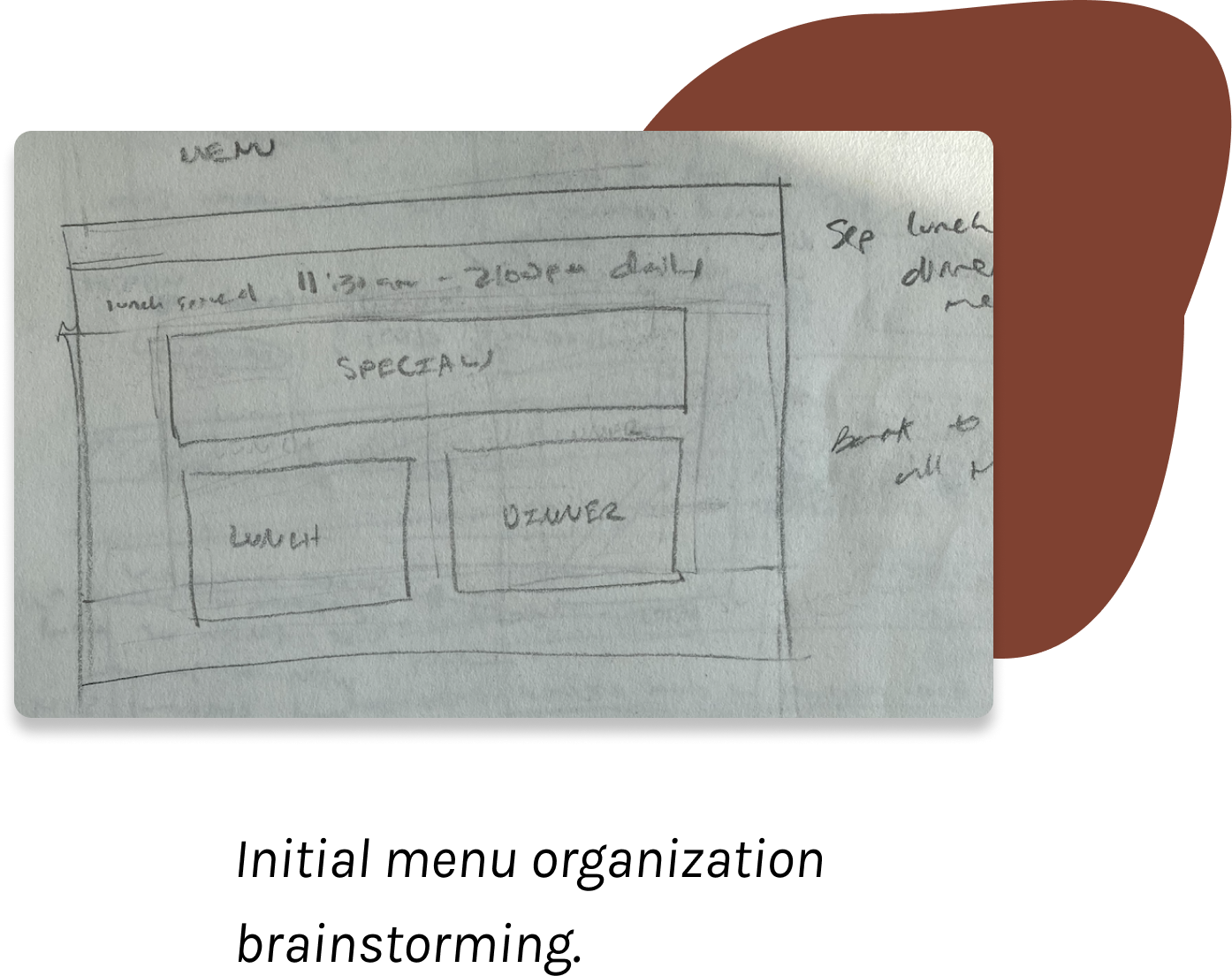
Making the current pdf menu both easily navigable for users and easy for Nora to edit was the most challenging part of the new website to design. Most chain restaurants I looked at had a dropdown menu with a separate page for each menu section, which would be the easiest for users to navigate through. However, the code for this would be more intricate, hard for Nora to update. On the other hand, the current pdf menu was super convenient for Nora, but difficult for users to scroll through. After several discussions with my teammate, and looking through many javascript libraries for inspiration, I decided to pull elements from both initial solutions to create a navigable carousel made of PNGs for each menu page. With this solution Nora could easily update the specials page by simply uploading a new png, and customers had a dropdown menu that automatically scrolled the carousel to the specific menu section they clicked on.
Synthesizing my ideas into a set of high fidelity mockups, I presented my designs to the restaurant owner for feedback before coding up the final website with HTML, CSS, and Javascript.

Final Design

squiggly red line

First Experiences and Further Improvements

The final website is responsive and mobile friendly, with...

2520

average
monthly visits

&

495%

increase in visitors
within first 5 month
of launch

Visit site here

Aesthetically, the dark gray, red, and tan color scheme inspired by the logo and physical building aims to transfer the restaurant personality onto the online landscape amidst COVID19.

1. Covid Notification

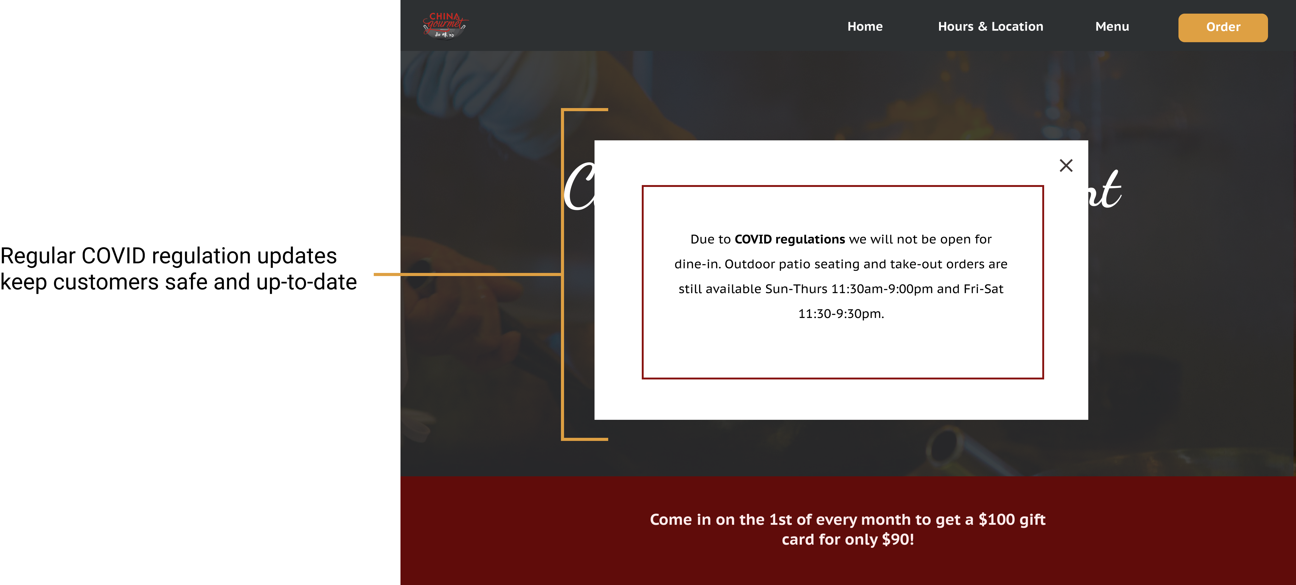
The website opens with a COVID updates popup. We decided to present the information in this format as it would be unmissable, and easy to update with further changes in COVID regulation for restaurants.

2. Home Page

When presenting my high fidelity mockups to Nora, we realized that she would not be able to consistently update the specials section on the homepage with new pictures and text, so it is omitted from the final design. On the customer side, the immediate order buttons allow regulars to quickly order, while the “About Us” section aims to introduce the restaurant to tourists.

3. Ordering

To address the main goal of including China Gourmet Longmont’s new online ordering options, the order button now opens into a popup where the two ordering options are clearly defined. This helped the restaurant adapt to customers' new ordering habits, and increase the number of orders through lockdown periods. Including a “View Menu” button on the pop ups also makes the menu easily accessible for ordering.

4. Menu

We changed the previous 10 page pdf menu into a carousel of pictures that can be navigated using the drop down menu or left and right buttons. The pictures are easy for Nora to navigate, and the menu is much easier for customers to look through now.

5. Hours and Location

The “Hours and Locations” page hosts a new embedded map feature so customers and delivery drivers can quickly view the restaurant location, or open directions in google maps.

Reflections

squiggly red line

I really enjoyed working on this project because I was able to combine my experiences as a previous employee, and learnings from my first web design class to help out a restaurant I care about. It was my first time working on a design project with a teammate, so it was nice to have someone I could get design feedback from, and work through challenges with. Through this project I practiced designing and implementing a website with multiple pages, using github to collaborate on code, and balancing the needs of different user groups.

Overall, I think this was a really successful project. The website now has over 2,000 visits each month, and has streamlined the online ordering experience for customers. I also updated the user interface with new colors, typography, and pictures inspired by the restaurant’s logo and physical building. However, I also encountered many challenges through this project, and discovered some areas that I would like to grow in.

Making the website standard and responsive in all browsers and screen-sizes was very difficult with my current basic knowledge of using HTML/CSS/Javascript to code from scratch, so for future projects I would plan to look into bootstrap and react. Additionally, I tried to made the website accessible with contrasting colors and alternative descriptive text for every image so that individual with any visual impairments could still use the website, but I am sure that I there are many more aspects that I have not considered yet, and I look forward to growing in this area with future projects.

More Work